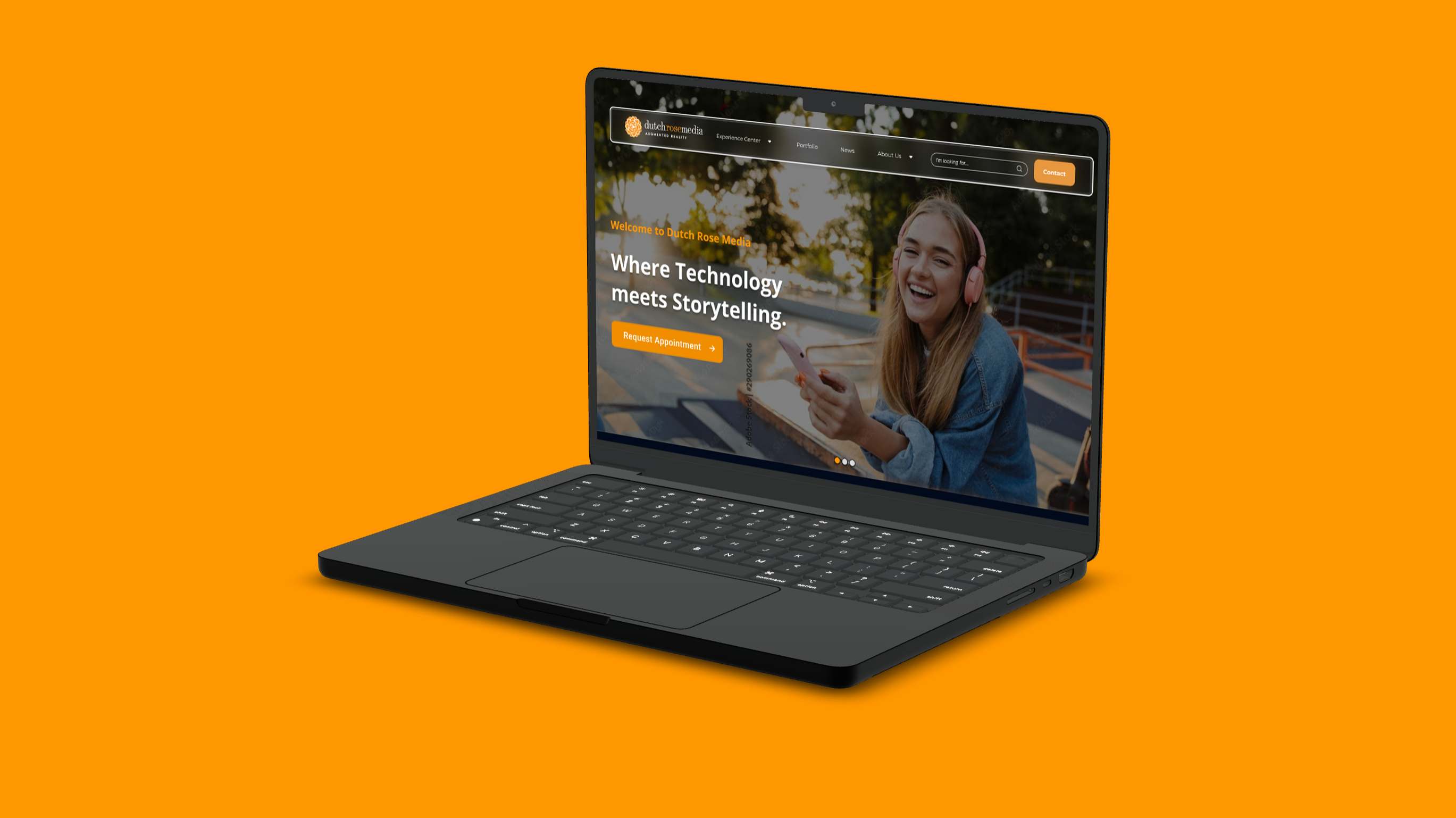
Redesigning an AR/VR studio's website to turn portfolio views into demo requests
During my 5-month internship at Dutch Rose Media in Eindhoven, I was tasked with transforming their website from a passive portfolio into an active sales tool. The company creates immersive AR/VR experiences for clients like PSV Eindhoven, KNVB, and Philips, but their outdated website wasn't converting visitors into leads.

The website hadn't been updated in two years. It showcased impressive work but lacked clear calls-to-action and a guided path for potential clients to request demos or get in touch.
I interviewed five team members (developers, producers, and management) to understand their vision. I analyzed competitor websites and surveyed current users to identify pain points and opportunities.
Using the Double Diamond methodology, I created three targeted landing pages and each page is focused on a specific service (Location-Based AR, Safety Training, Fan Engagement) with strategic CTAs throughout the user journey.
I continued using their existing brand colors while applying them more strategically to guide user attention
A hierarchy using Helvetica Neue across different weights
Building blocks designed for consistency and conversion
 Simplified navigation
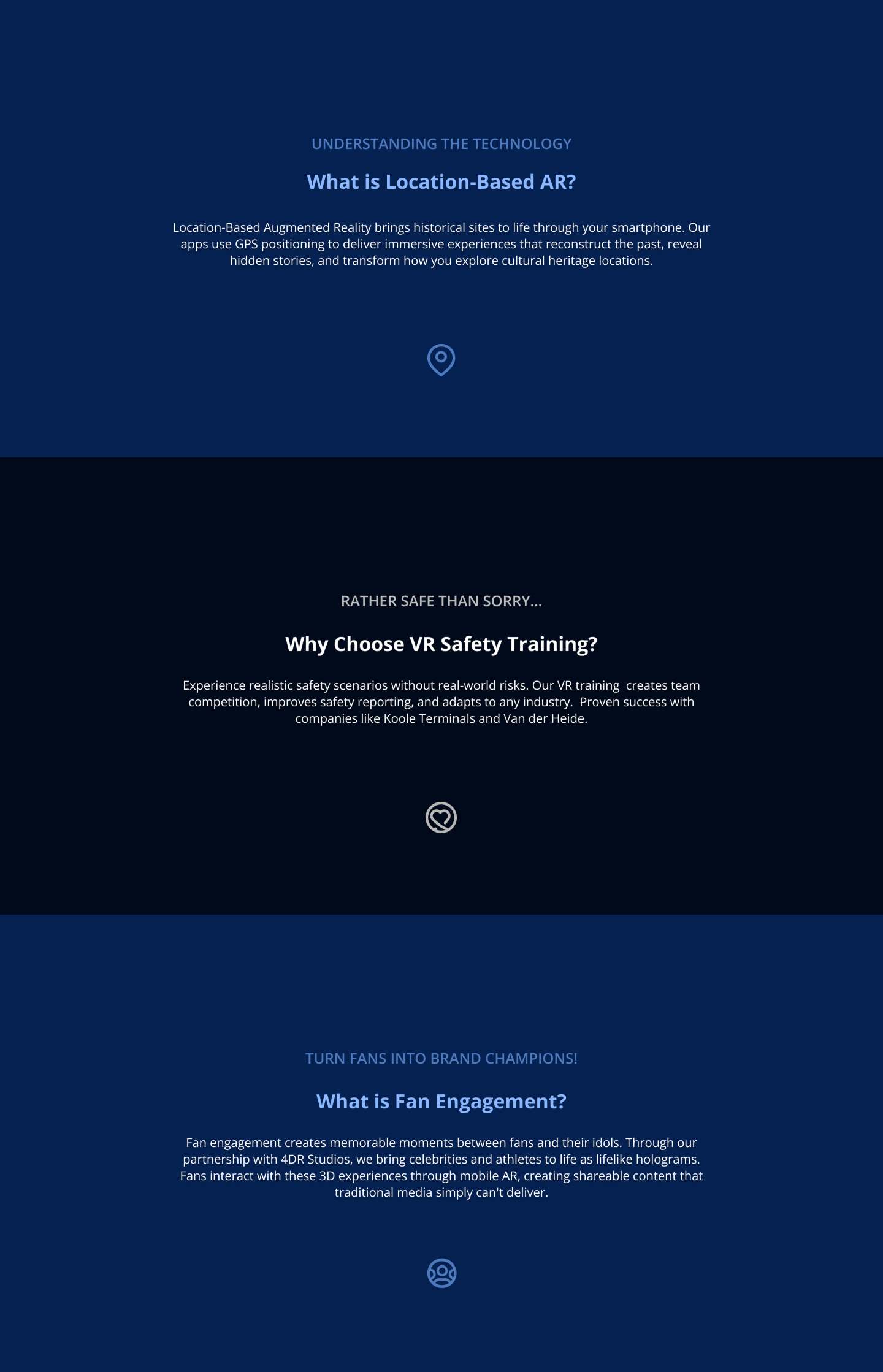 Service showcase cards
From creative and chaotic to strategic and simple
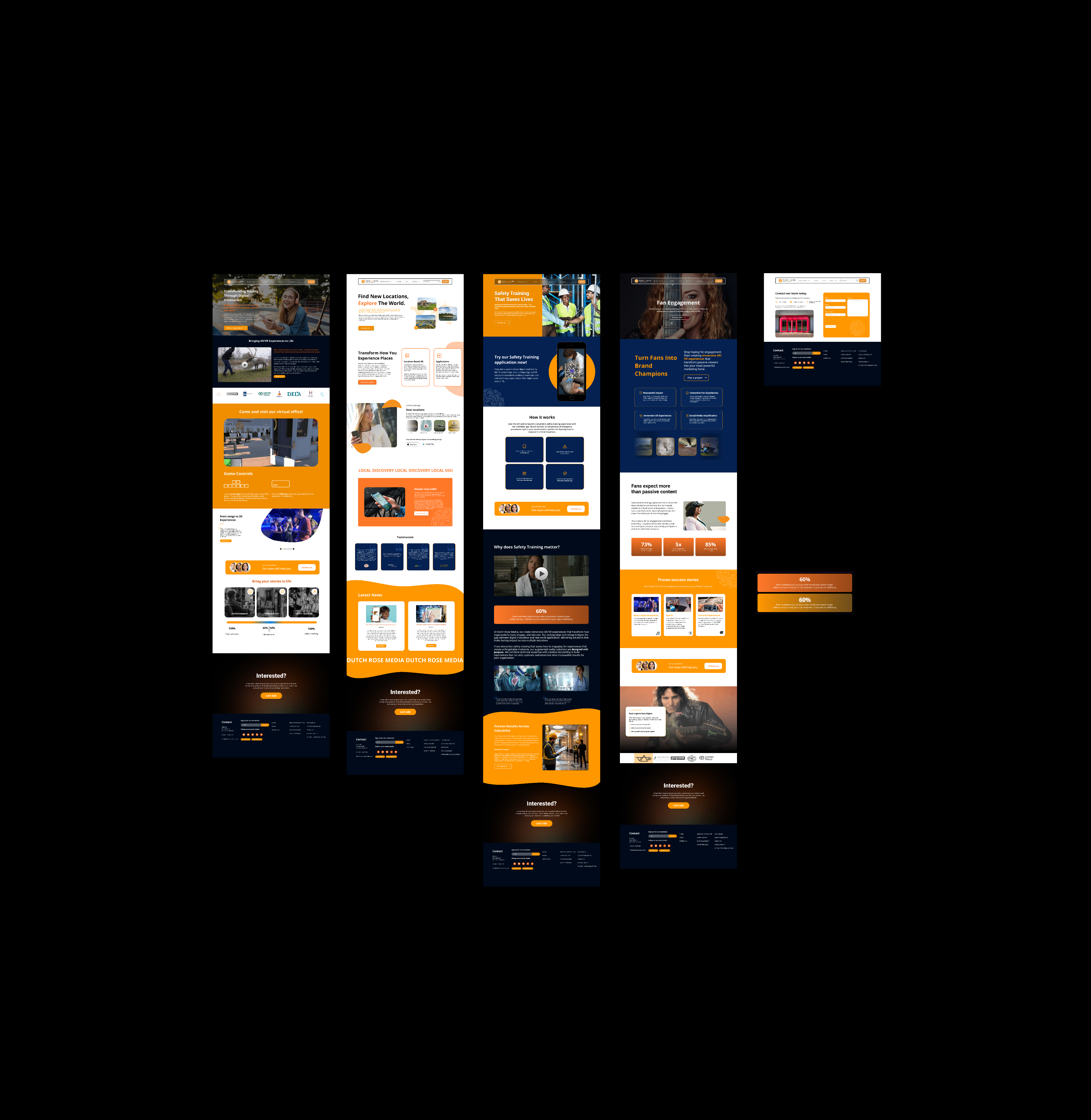 Version 3 - Creative but chaotic, with too much text.
After showing my third design to my boss, she appreciated the creativity but pointed out it was too chaotic to implement effectively. She emphasized: "Make it simple and straightforward, it'll become cleaner."
Before receiving this feedback, I worried this would look lazy. But redesigning with structure taught me that clean, consistent design isn't boring but could be very 's professional. It helps users know what to expect and guides them smoothly toward taking action.
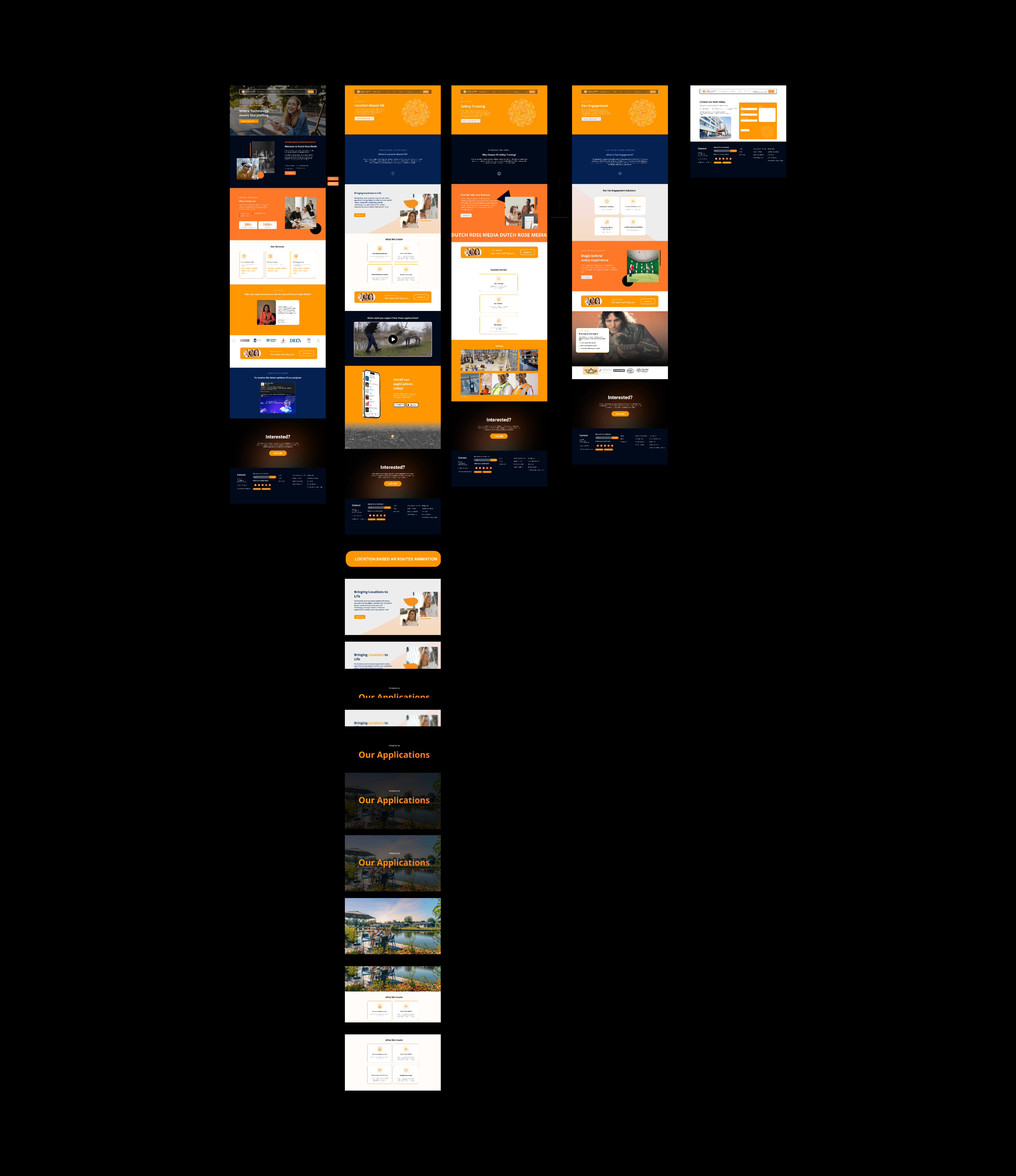 Version 4 - Final design with clear structure
Each page addresses a specific client need with focused messaging
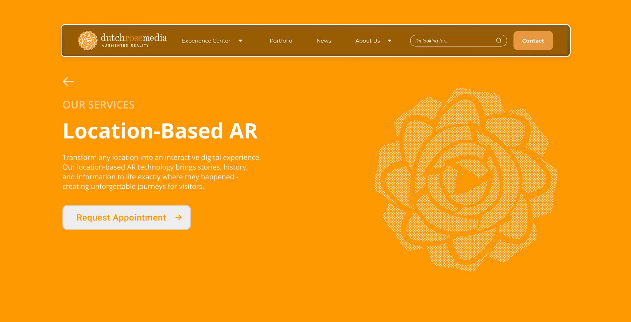
For entertainment venues and tourism
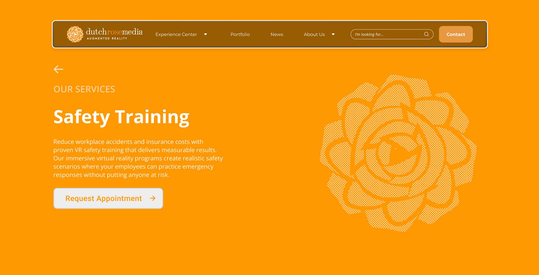
For industrial and corporate training
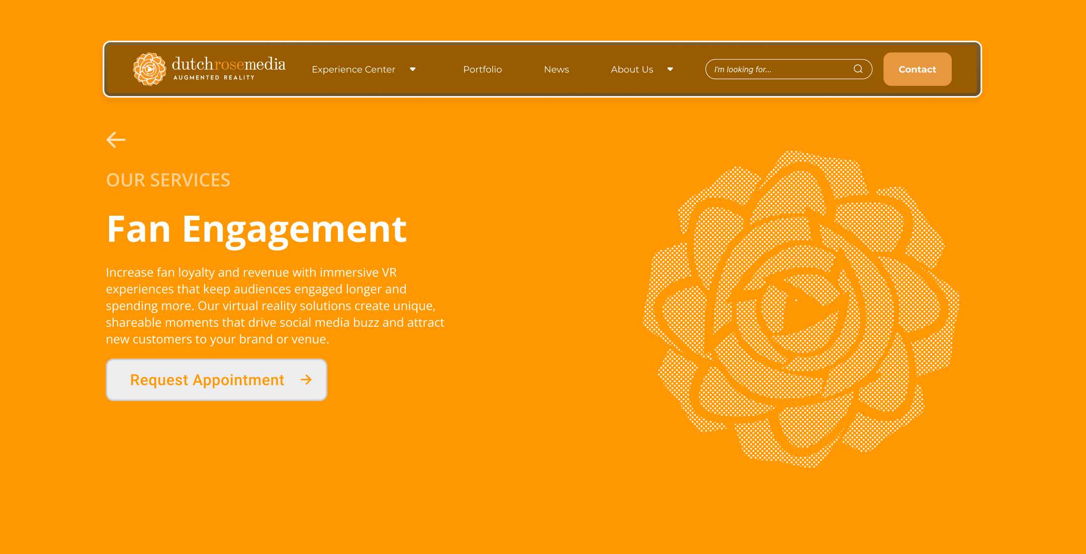
For sports teams and brands
I learned Elementor to bring one of the landing pages to life on their live website
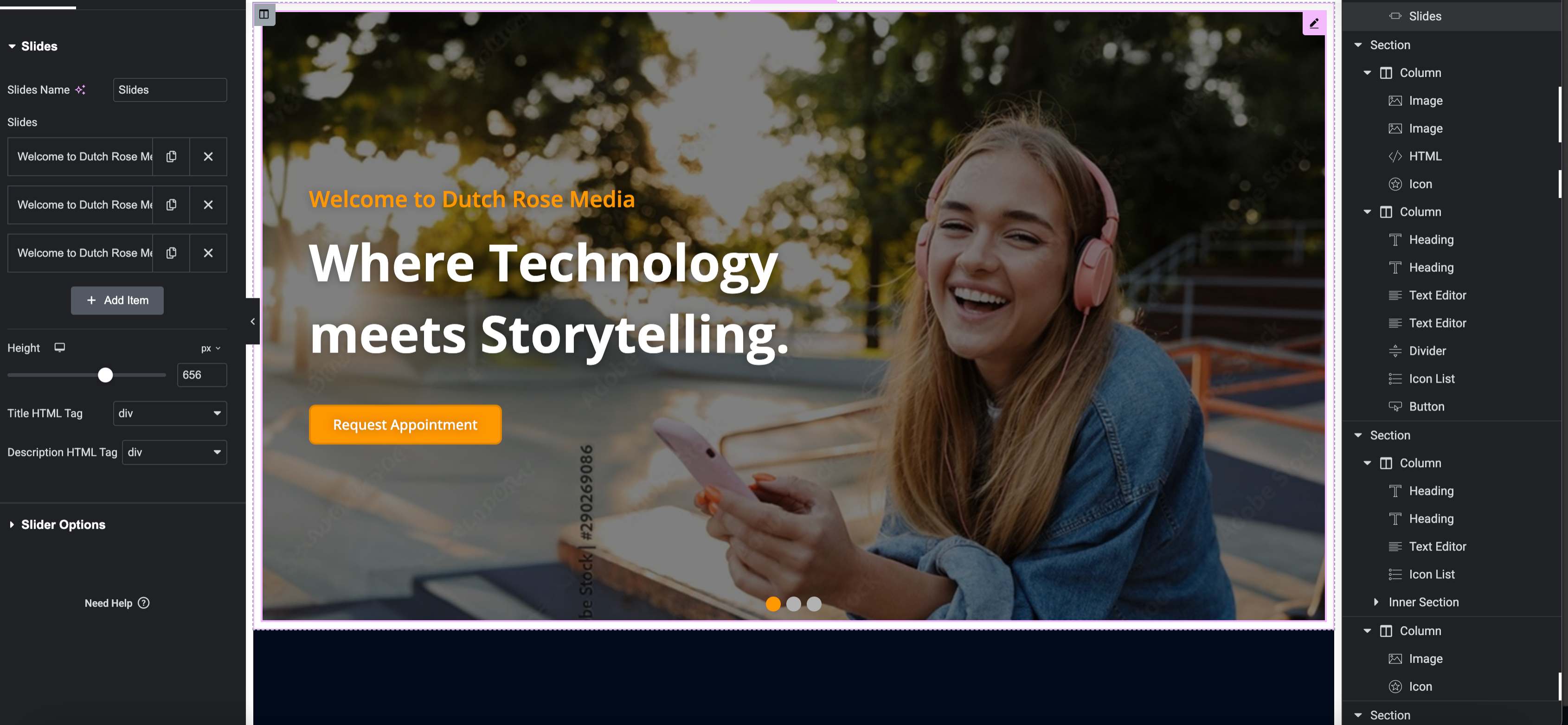
Next to the main project, I contributed to various extra company projects
Designed prototypes for Center Parcs: Memory and drawing games.
Created LinkedIn visuals and AR video reels to showcase company capabilities
Represented Dutch Rose Media at Night of the Nerds gaming festival, helping attendees experience VR demos
The biggest lesson: companies don't just want creative designs but they want strategy and clarity that drives results. Simple, consistent design with clear CTAs goes over flashy complexity every time.
Learning to see critical feedback as constructive rather than negative was crucial. My boss her honest feedback about simplifying the design made the final product much stronger, they're planning on using the designs too.